Web Design Trends
This year is full of new developments in the world of digital marketing and in our blog you can find all the relevant news. The most interesting thing that this year brings us are the new trends in web design.
In the world, there are more than 2 million websites that combine with a groundbreaking and trend-setting design. But don’t worry, you can stand out among them and bring notoriety to your brand.
Grab a pen and paper and take note of the web design trends this year!
10 web design trends for 2023
In the trends we’re going to see below, there are some that remain firm, others that evolve for the better and others that change radically.
Let's take a look at what we at Coco Solution believe to be the web design trends that are going to set the tone for 2023.
1. Vectors will still be relevant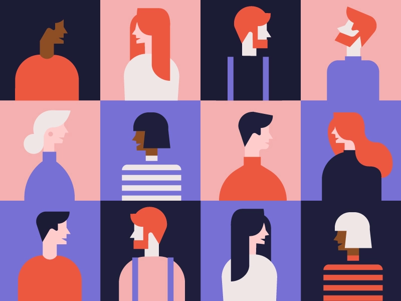
Graphic elements are an indispensable element within a website. They give the site a visual packaging that has been used for some time and is likely to continue to do so.
There are free image banks where you can download images without copyright, which can help to personalise a brand or project.
2. Animations are consolidated
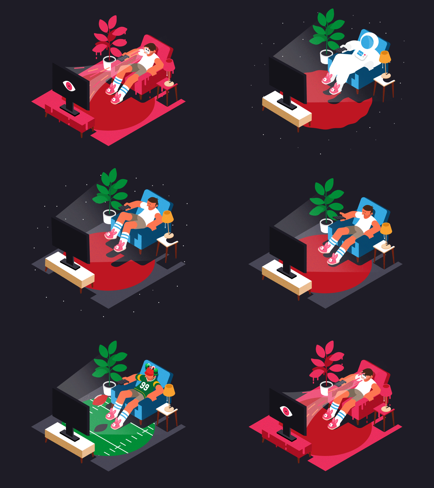
They arrived in the wonderful world of web design a little on tiptoe and have earned an important place in the development of a website.
Animations can have different movements: both to the right and to the left, up or down, with effects, different speed, etc.
3. Chatbots: the humanisation of design
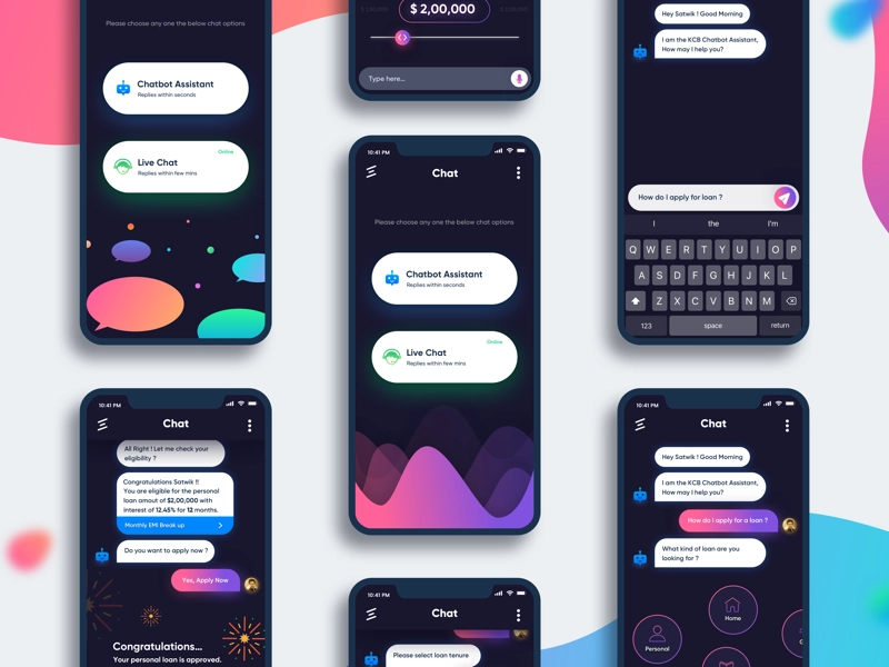
Artificial intelligence has fully entered the new web design trends of this year. As you know, it’s an element present in social networks and web development that has now evolved to become a much more humanised entity.
With AI, the aim is to better manage processes with customers, personalised recommendations, help them in the purchasing process, etc.
4. Gradient as a differentiating element
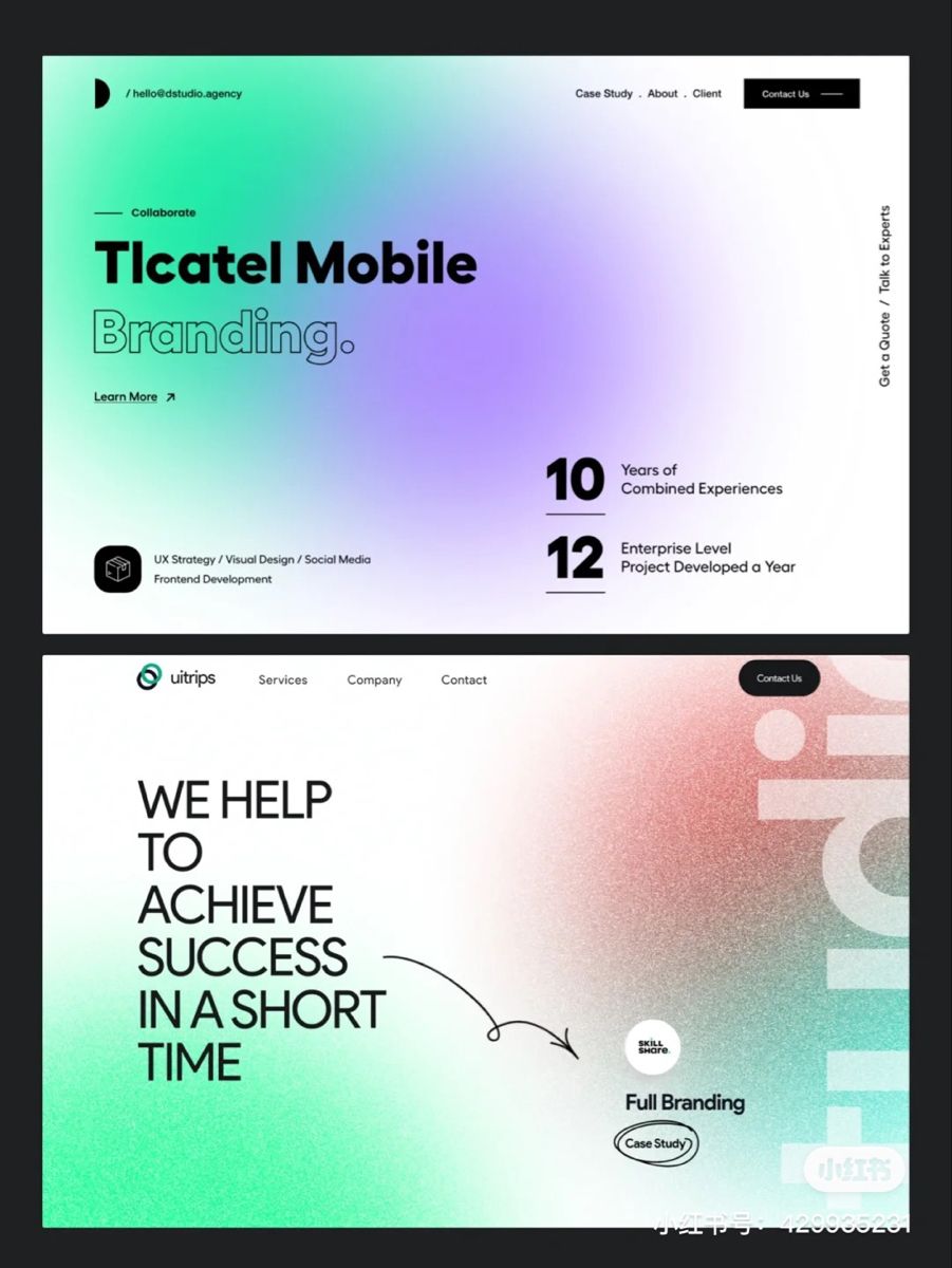
Gradients have been appearing on the web design scene for some years now, and they don’t seem to be going out of fashion. But this year brings us some novelties in terms of the way it’s used.
The trend is to use the gradient with grain. This effect adds a new texture and gives a more natural look to our website.
You can add it in its entirety or any of its sections, using it as a background or within objects such as illustrations.
5. A new way to scroll
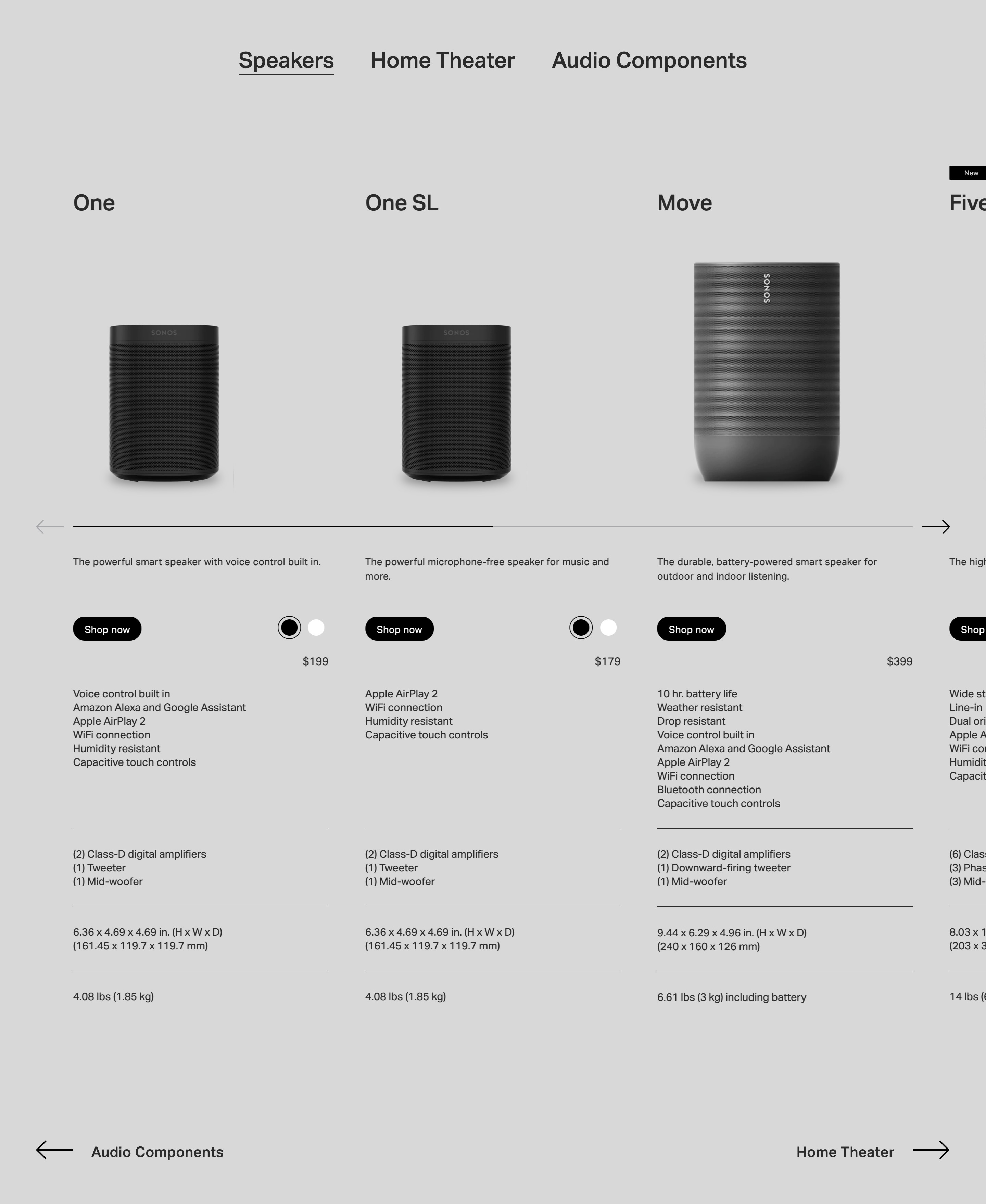
The scroll is an element that has been gaining an important weight within the web design of marketing agencies. More and more websites are introducing animations or effects when scrolling to attract the attention of users.
In 2023, horizontal scrolls on web pages will be present, showing new content from left to right or from top to bottom.
6. Retro aesthetics: back to the basics
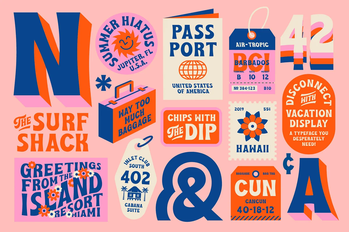
Nineties fashions are back, and not only in terms of fashion. They’ve also made a strong comeback in the web design scene, and many designers have taken to adopting this striking aesthetic.
This trend often appears in icons such as shopping carts, FAQs or search buttons.
7. No more images on the homepage
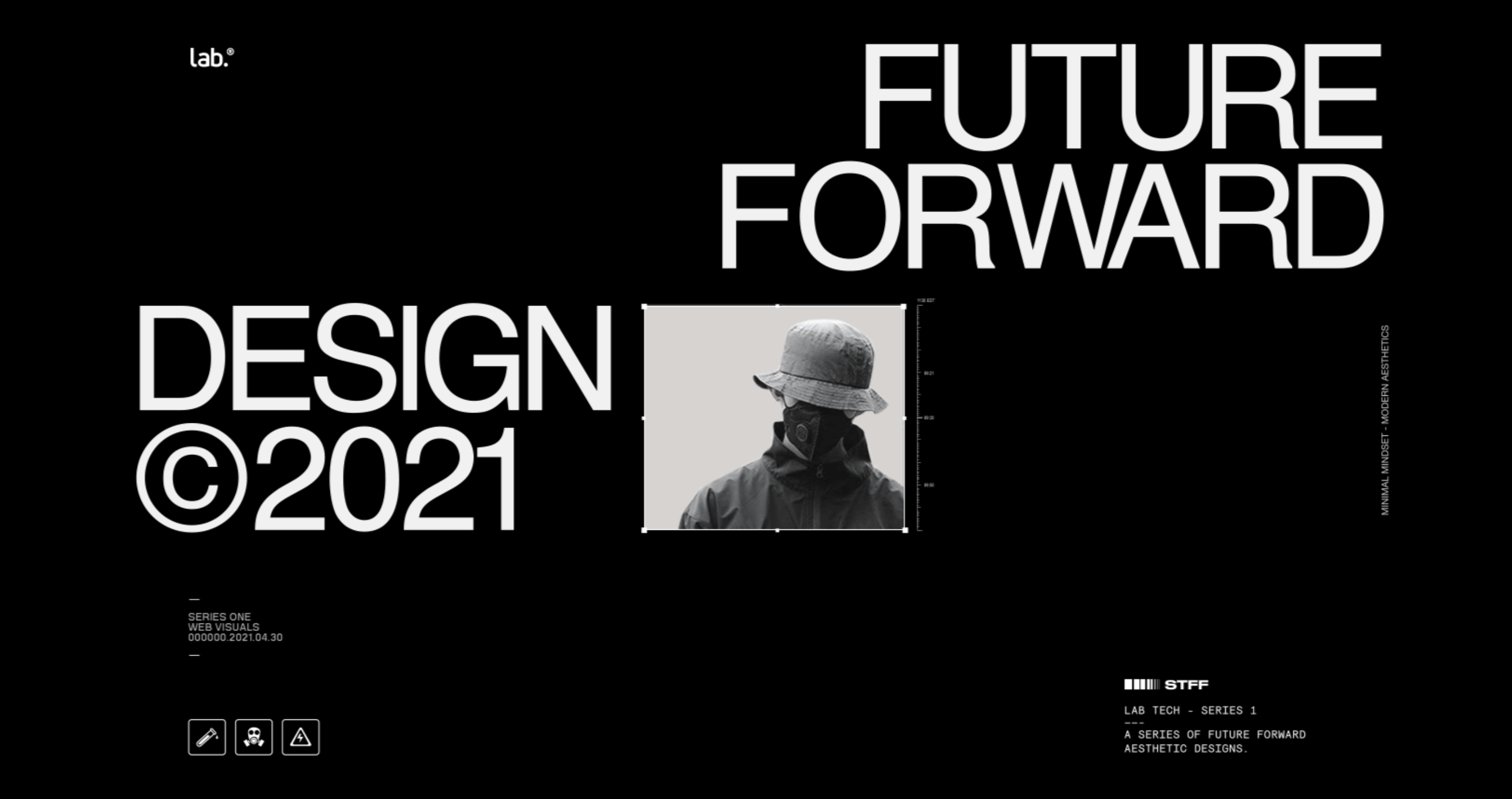
Images show how the winning workhorse of web design has been somewhat relegated. The personality of a brand can be expressed through typography or coloured backgrounds, where the user can interact with the content in a more natural way.
8. Photos, the more detail, the better
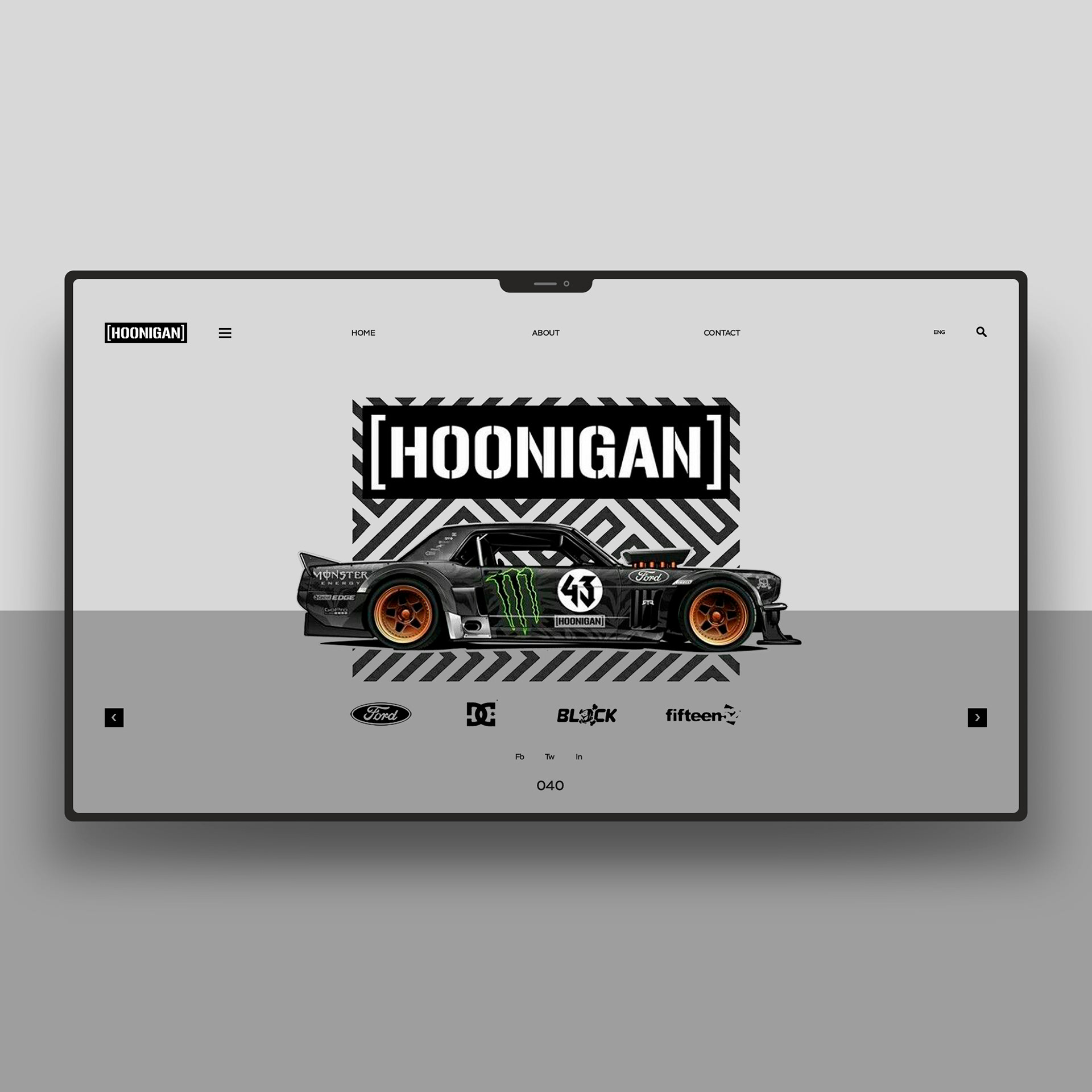
In addition to the current trend of using large images, the trend is also to add more detailed photos.
In this respect, you have to be careful. Adding large images can be detrimental to the loading speed of the web, so it’s recommended to put this type of photographs with details on the home pages.
9. Dark mode
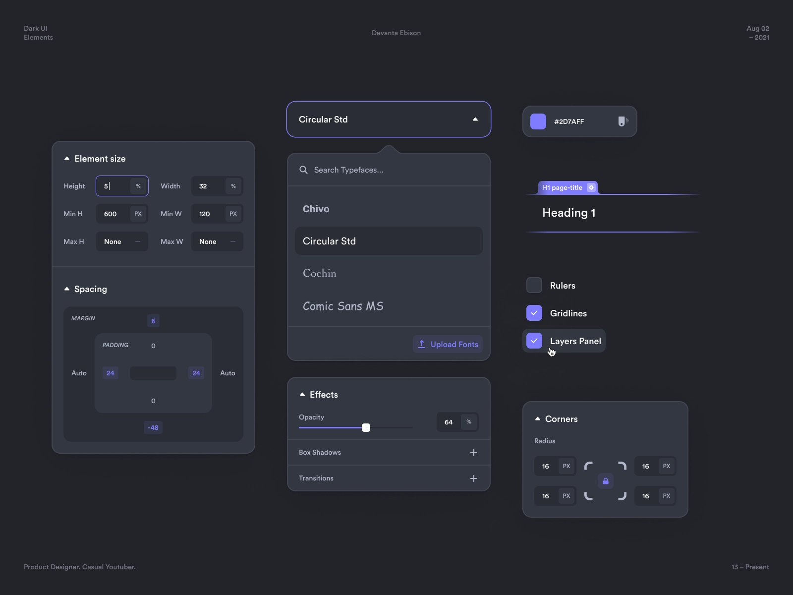
Designs are becoming more and more interactive, offering the user the possibility to personalise the website for their clients. Dark mode is a growing trend.
Thanks in large part to the boom of dark backgrounds on mobile terminals and applications, it has guaranteed a better user experience, in order to reduce visual fatigue and considerable savings in the batteries of mobile devices.
10. GlassMorphism
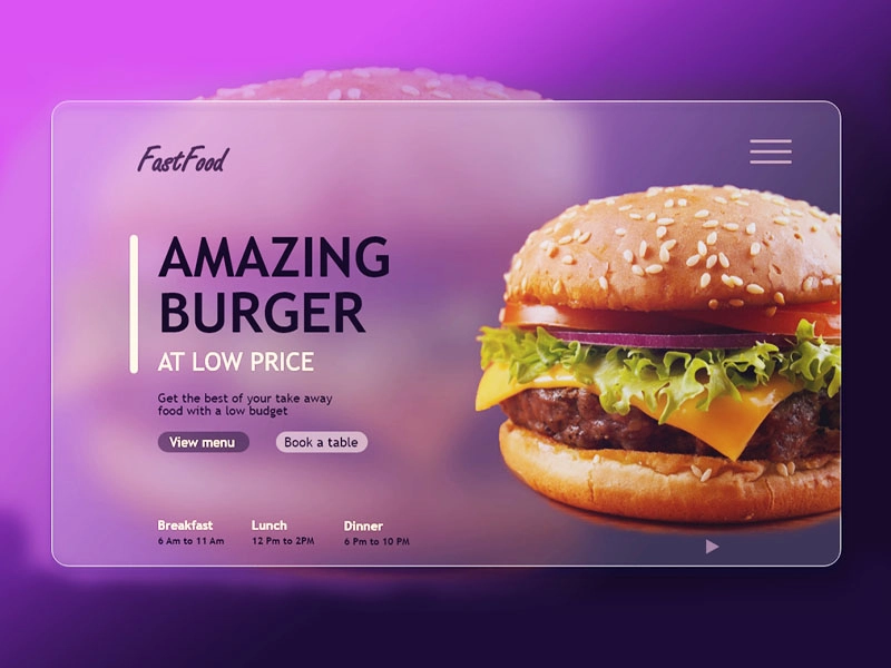
Glassmorphism is a way of creating elements that are visually composed as if they were glass. This new trend combines transparency with blurring and movement.
With glasmorphism, depth is achieved on the web thanks to the 3D effect and the use of transparencies.
So much for our review of the most important trends in web design this year. As you’ve seen, there are some new ones that are coming on strong and others that have managed to evolve and become elements to take into account.
In Coco Solution, we continue to offer all the news regarding the world of digital marketing. If you want to know more, stay tuned to our blog.


