Brand & Visual Design

Ornasur - Re Branding

Starting point

Ornasur is an agricultural company founded in 1988, with extensive experience in the cultivation of young plants and cut flowers. Throughout all this time it has specialised in the cultivation of chrysanthemums and their wide range of varieties.

Category: branding and corporate design.

Briefing

Since its creation, they had not considered a redesign of the brand until they found the need to improve their digital positioning and, therefore, it was important to consider a revision of the brand that would allow them to adapt to these new media and approach new target audiences without losing their original essence.

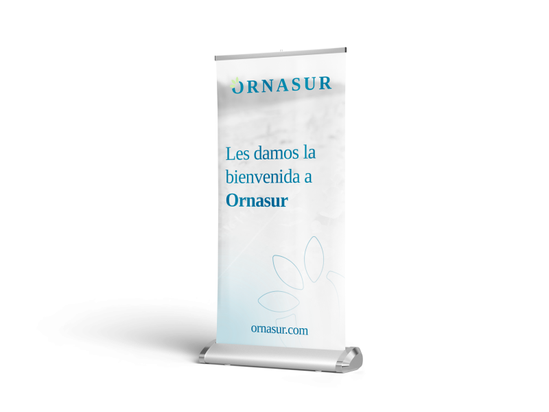
ornasur cartel

Approach

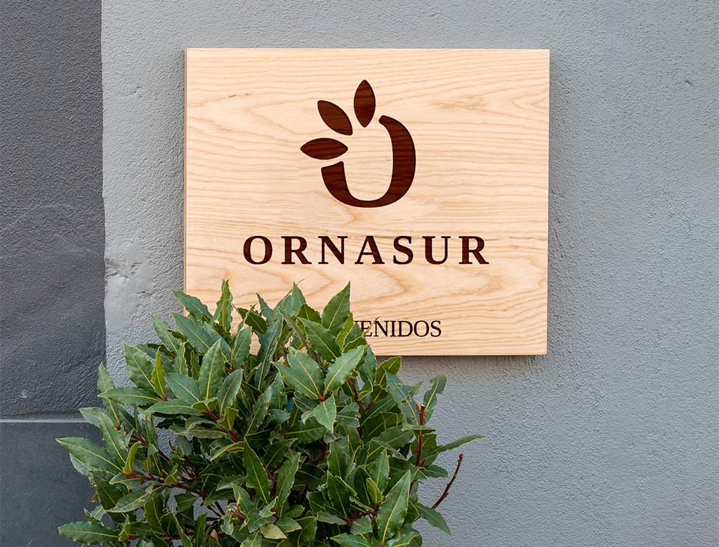
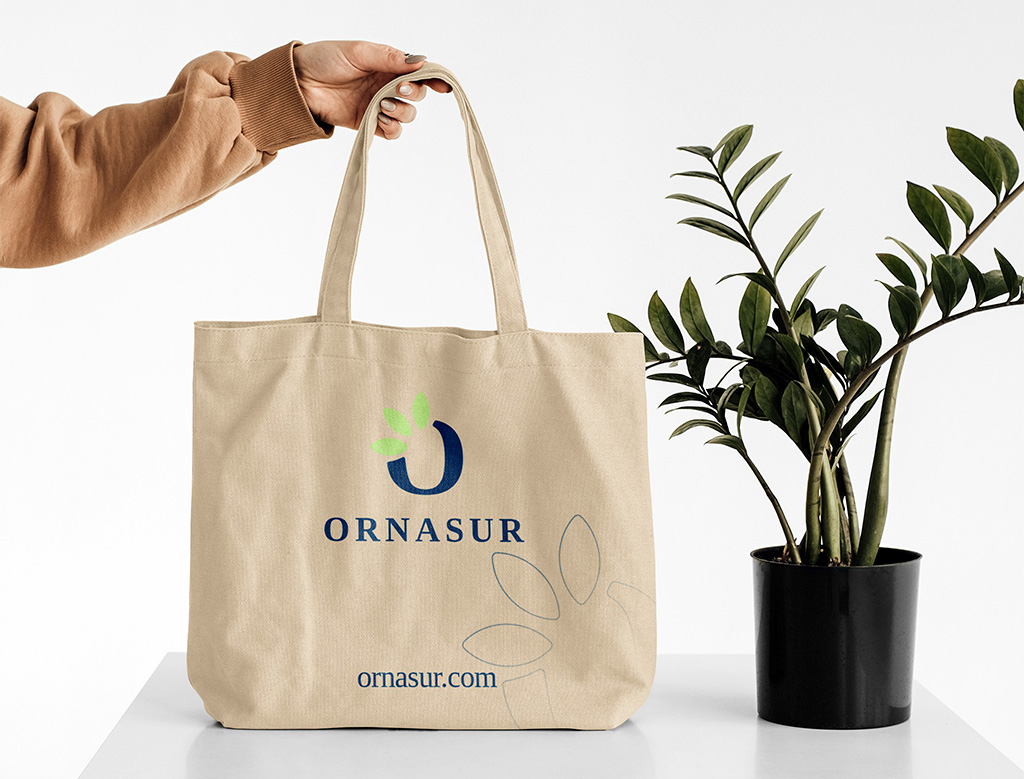
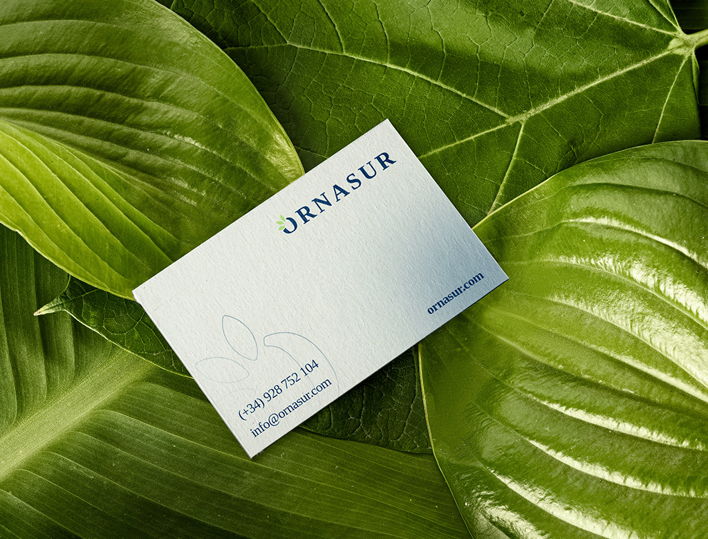
It was essential to have elements that were recognisable in the new brand, such as the petals in the letter "O", to improve the appeal despite renewing the brand image. On the other hand, we wanted to provide a formal and modern aesthetic at the same time, so we opted for a serif typeface that we modified by rounding the corners to make it less rigid and give it a closer character. Finally, we chose the corporate blue as the main colour and added the green colour that accompanies and gives firmness to the natural and organic concept.

Related projects